Do you want to become a better climber? Do you want to be able to get an overview of your training load and intensity? Would you like to know when you’re at risk for injury?
The Rockshoulders training dashboard is a tool that helps you to achieve exactly this. You track your training volume and intensity as well as pain and fitness levels so you can make better decisions on:
- When you can train more
- How much you can intensify your training
- When to take a break
- Where to adapt your training to prevent eventual irritation of painful body regions
Why is this important?
Training effects only happen over time, so the more time you can be exposed to training the more progress you’ll make. Thus, the less you’re injured, the less time spend on rehabilitation and the more time available to progress your training.
This training log will help you reduce the chance of injuries like pulley injuries, tenosynovitis, capsulitis, and climber elbow.
In this article, I’ll explain how to use the dashboard, what the data you fill out means, and how you should analyze it.
Let’s dive right in!
1. Why Should You Use the Rockshoulders Training Dashboard?
The idea to develop a smart training dashboard was born as I saw that every single one of my patients coming in with an overuse injury had suffered from the same pitfall (me included); lacking, or even nonexistent, management of their training load.
Here are two typical examples of overload injuries from rock climbing:
- “I went on a climbing trip and started climbing 10 pitch multi-pitches every day” (volume overload)
- “The one key move on my project was super hard, so I tried it a gazillion times” (volume + intensity overload)
So, what should you do if you want to manage your training load sustainably?
You first need to discover how much and how intense you’re training by logging your training. There is no other way.
If you want to do it all in your head – I thought for a long time I could do this– I ask you to think about how each of your training sessions went last week. What you remember is probably not accurately resembling reality.
Training is a process that lasts weeks, to months to years. How do you want to do this in your head?
So, that’s why you need to write it down.
The Rockshoulders Training Dashboard is designed to make you aware of how you’re feeling before your training, after your training, and if you felt any pain. This you fill out together with what volume and intensity you trained and the duration of your training. The Dashboard will then calculate the Acute to Chronic Workload Ratio (ACWLR), a scientifically proven formula that indicates your risk of injuries over the next weeks. More about the ACWLR later in this article.
First, let’s discuss the values you fill out in the logbook.
2. The Different Values You Should Track & What They Mean
Each day you train, fill out the date and what you did in the training session. You can select multiple types of training per session if you fill out the Excel file on your computer. For example strength training and stretching. I can’t do this on my iPhone because it doesn’t support VBA coding, which is necessary for this function to work.


On a side note, as you can see there are 4 “TD’s” or “Training Diary” tabs. This division in quarters is to ensure that you maintain an overview and don’t have to scroll forever to get to your training session.

2.1 Freshness
Freshness is the first subjective value you fill out, preferably before you start your training or climbing session. The simple question is: “How fresh do you feel at this moment?”. You must fill out a number from 1-10 where 1 means you’re not feeling fresh at all and 10 means you’re feeling as fresh as you can be.
This is a subjective number and that’s why you shouldn’t compare yourself to what your buddy fills out after a similar training week. This is your log, which should reflect your experience. The better you fill it out the more reliable the log will become.

2.2 Training Duration in Minutes
Your training time in minutes can either be:
- the time from when you start your warming up until you finish your training session or,
- the actual time you’re training which you can measure with a stopwatch or a Smartwatch.
I always measure from my warming up until the time I finish training or climbing. Because during the breaks in between I’m still focused on my training and I continue to use energy. Another reason is that it’s also the easiest way to track.
If you opt for a combination of the two that’s also possible. For example, you can log your training time in a regular gym climbing session from warming up until you’re done. And when you go rock climbing, when breaks are often longer, you can track each climb separately.
The most important thing is that you always track the same. So, choose one of the options and stick to it.

2.3 Rate of Perceived Exertion (RPE)
Rate of Perceived Exertion is another subjective 10-digit scale that you can use to measure how tired you are after your training. It is therefore a good measure of how intense your training was. A scientific paper of 2022 that discussed the use of the RPE in comparison to the heart rate of female basketball players noted that the longer the players used the RPE the better it correlated with their objective level of exertion as measured by their heart rate.
Unfortunately, there is no similar research on climbers. Yet it’s important to remember that as a climber you never reach your max heart rate while climbing because the most used muscles in climbing, the arms, and forearms, don’t require that much blood supply. So, as a climber, you can’t look at your overall exhaustion only for RPE but you have to look at a combination of things like:
- Decrease in form
- Decrease in finger strength, i.e. your hands opening-up
- Difficulty in maintaining body tension
- Reduction in focus
- Increase in wrong decisions on the wall, i.e. failing to read the sequence or grabbing holds inefficiently
Like the basketball players, you will discover along the way better and better what your maximal climbing exertion is and therefore which RPE correlates to which sensation.

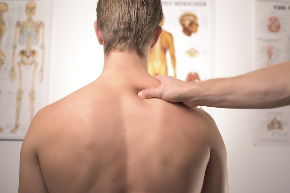
2.4 Pain Level & Where Did You Feel Your Pain?
Humans are biased toward remembering the positive better than the negative. Since pain is usually seen as something negative, you’re more likely to suppress it. Even more so because it might implicate that you need to climb less or maybe even take a break. That’s not something you want right?
This is exactly why you need to track when you feel pain. Because it’s okay to feel pain in a certain body region, but if it keeps recurring, you should act on it and figure out the origin.
If you felt pain during a climbing or training session, select “Yes” in the Training Diary and rate your pain intensity from 1-10. 1 is the least pain you can imagine and 10 is the worst pain you can imagine. Then write down when and where you felt the pain. With this data, you could inform an eventual future healthcare provider to help you treat or prevent an injury.


2.5 Notes
If there’s anything particular about your training session you should write it in the “Notes” section. This can be anything like “I felt like I was getting sick”, or “I had an intense day at work today which affected my energy levels”. Besides that, I usually write down what type of training or climbing I did here.
Now you have filled out all the data in the training diary, it will calculate the Acute to Chronic Workload Ratio and it will plot graphs of your freshness, RPE, and pain levels in the dashboard.
3. How to Read the Training Dashboard?
Each of the quantifiable training markers from the training diary is plotted on a graph in the dashboard.
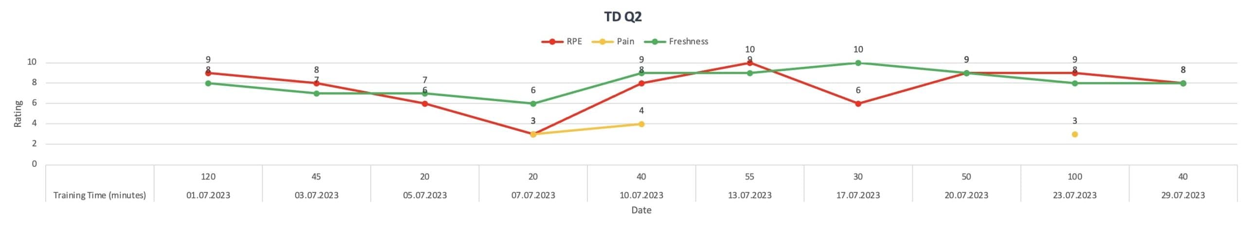
This means that you have a line for freshness, RPE, and pain levels. Each of these has an expected behavior as you progress through a training phase.
- The RPE should be equal throughout the training cycle. In the beginning, this means you can do more work and towards the end, as fatigue accumulates, this means you might be able to do less with the same training intensity. Another scenario would be that you adapt to your training load after a couple of weeks and as a result can grind out more training with the same RPE.
- Freshness is likely to be higher at the start of a training cycle and after a holiday and then reduces as your training cycle progresses. Then one of two things might happen, your freshness keeps getting less because you fatigue more. Or it stabilizes (and might get better again) when your body has adapted to the new training load. Similar to what happens to your RPE.
- Pain levels should preferably be 0 at all times. However, this is unrealistic. The more you train the more you push your tissues to their limit. Also, when you fatigue, it’s more difficult for your nervous system to inhibit nociceptive signaling. These are the alarm signals the brain receives from the body to which it responds either by inhibiting it or sounding the alarm and making you feel pain. When you’re tired the latter is more likely. These pains should subside when you take time to recover. If the same pain bothers you for more than 10-14 days seek help from a medical professional.
After you fill out all the data for your training for more than 28 days the dashboard calculates your acute to chronic workload ratio (ACWR) based on your RPE, Volume, and an average of both.
4. Acute to Chronic Workload Ratio (ACWR)
The ACWR is a ratio that indicates your injury risk and is calculated based on your training load in the last week (acute) divided by your training load in the previous 4 weeks (chronic). The idea of the importance of Acute : Chronic Workload Ratio was first introduced by Australian researcher Tim Gabbett in 2016. It has since been researched extensively, with the main goal being to figure out:
- What number of days is best for acute and chronic loads
- Which data should you track to get a ratio that predicts injury risk reliably?
- What ratio correlates with the lowest injury risk?
As to the first 2 questions, a large number of studies have been done testing a variety of performance measures and a variety of acute and chronic periods. Among these are:
- Total high-speed running distance
- Spring distance
- Session RPE
- Total training time
- Total running distance
- Heartrate
- Total times of acceleration
- Number of training sessions per week
And anything from 3:15 to 7:28 day acute to chronic workload divisions has been tested.
That’s cool, right?
We don’t know yet which is best, but we do know that there is a correlation. The same systemic review indicated that a ratio between 0.8 and 1.3 seemed to correlate with the lowest injury risk.
Now you know what the ACWR is and why I included it in the Training Dashboard. I’m super curious to find out what will be the best variable to track in rock climbers as the sport is so technical and therefore hard to quantify. Should you calculate the number of extreme moves, total meters climbed, heart rate, RPE, or the total sessions you climbed around your redpoint grade?
Until you or I have figured this out I believe it’s best to keep it simple. So, your ACWR is now calculated based on an external training factor (total training time) and an internal training variable, your Rate of Perceived Exertion.

If you are planning a training phase you can fill out the sessions ahead of time, the time you will be training, and the RPE you’re aiming for. You can then look at the ACWRs and get an idea of what you’re doing is sensible.
That’s all as far as the training dashboard itself goes. It’s a great tool to help you generate insight into your training and risk of injuries. Yet it’s of no use when you don’t fill it out. That’s why you must find a way to do so easily.
5. How to Make it Easy to Use the Rockshoulders Training Dashboard
You can fill the training dashboard out on your computer, phone, or your tablet. The best of all is the computer because that’s where Excel has full functionality. This means that you can multi-select what you did during your training and that you can refresh the training dashboard. Yet, when it comes to the habit of filling your training diary out, and if you’re anything like me, it’s more likely you’ll do it on your phone.
So, if you have an iPhone you can use the “Shortcuts” App to create a shortcut on your home screen which opens the Excel file. On Android, you can create a shortcut directly in the Excel file and on the computer as well.


Open the Shortcuts App on your iPhone and press the “+” at the top right of your screen. Then in the screen shown here press “Add Action”

Search for the Rockshoulders Training Dashboard Excel file on your iPhone and add it in the “Shortcuts” App. Tell it to open the Excel file in “Default App”
On Android, you can go to the training dashboard Excel file and go to options to create a shortcut. On Windows, you do the same as on Mac but click “Create a Shortcut”.
6. Optimizing the Training Dashboard
Once you start using the dashboard you might run into things that aren’t the way you like it or that are missing. If you have the necessary knowledge in Excel, you can edit it right away. Please send me your update so I can consider including it in my Dashboard too.
To me, the Rockshoulders Training Dashboard is a work in progress. My aim is to make it as easy to use as possible, to discover which data is most representative of rock climbing performance and which data is easiest to fill out for you as a climber.
Send me an e-mail when something isn’t working for you so that I can consider changing it in the original file.
7. Closing Notes on Logging Your Training
Finally, the training dashboard should help you to understand your training and your mental and physical responses to training better. It doesn’t mean, however, that you should completely ignore how you’re feeling when the Dashboard says you should be fine. As unspecific as the following advice might be, it is important to always use common sense when making decisions about your health and training. If something doesn’t feel right, don’t engage with it. Ask someone to help you understand.